brand identity | DIGITAL DESIGN | print design
Rebranding for coherence and connection
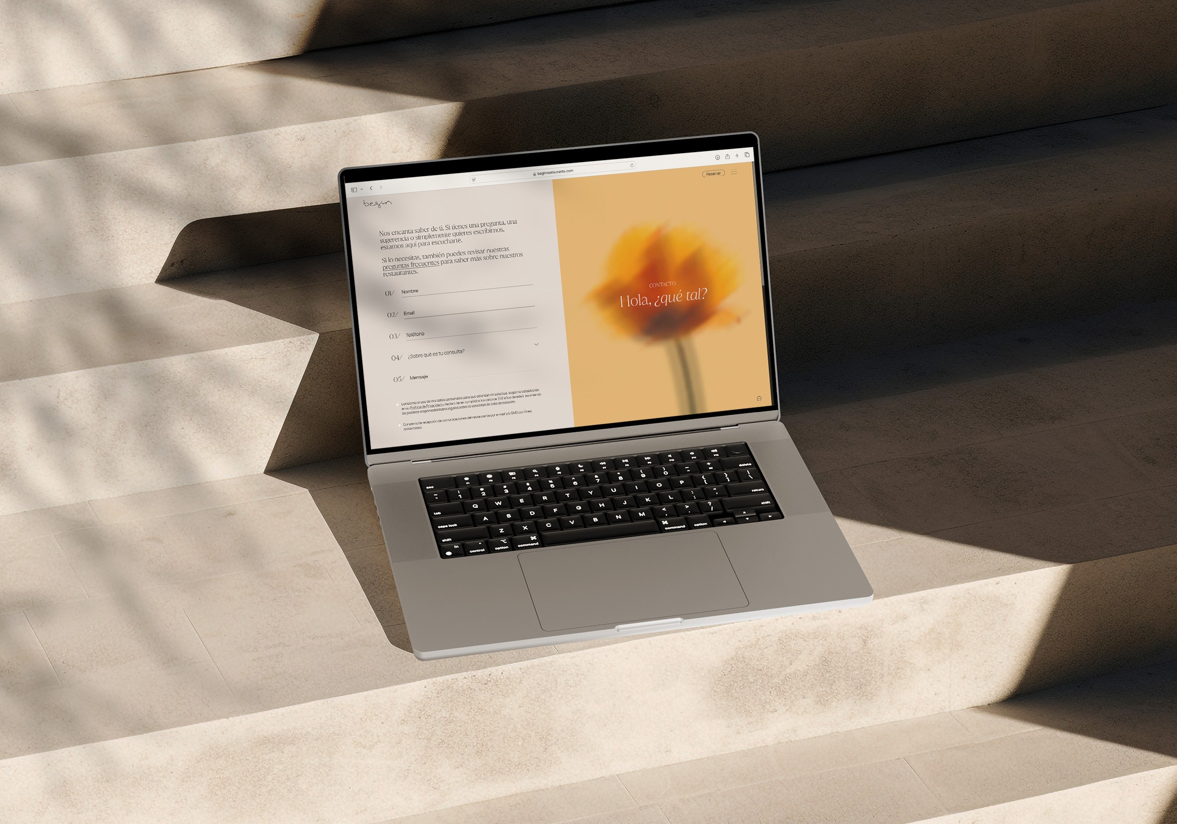
A brand reborn to embody the balance between nature and city life. The new visual identity and tone of voice evolve the brand across every touchpoint, making Begin a true reference in the restaurant industry.
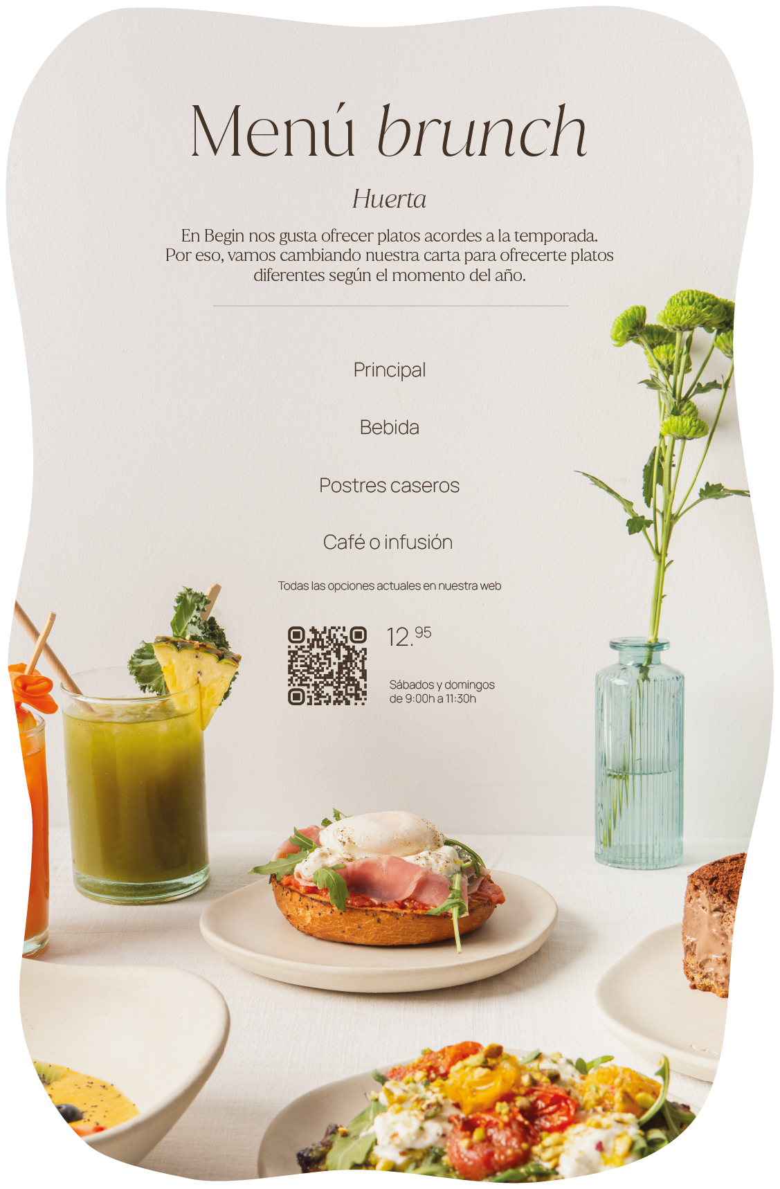
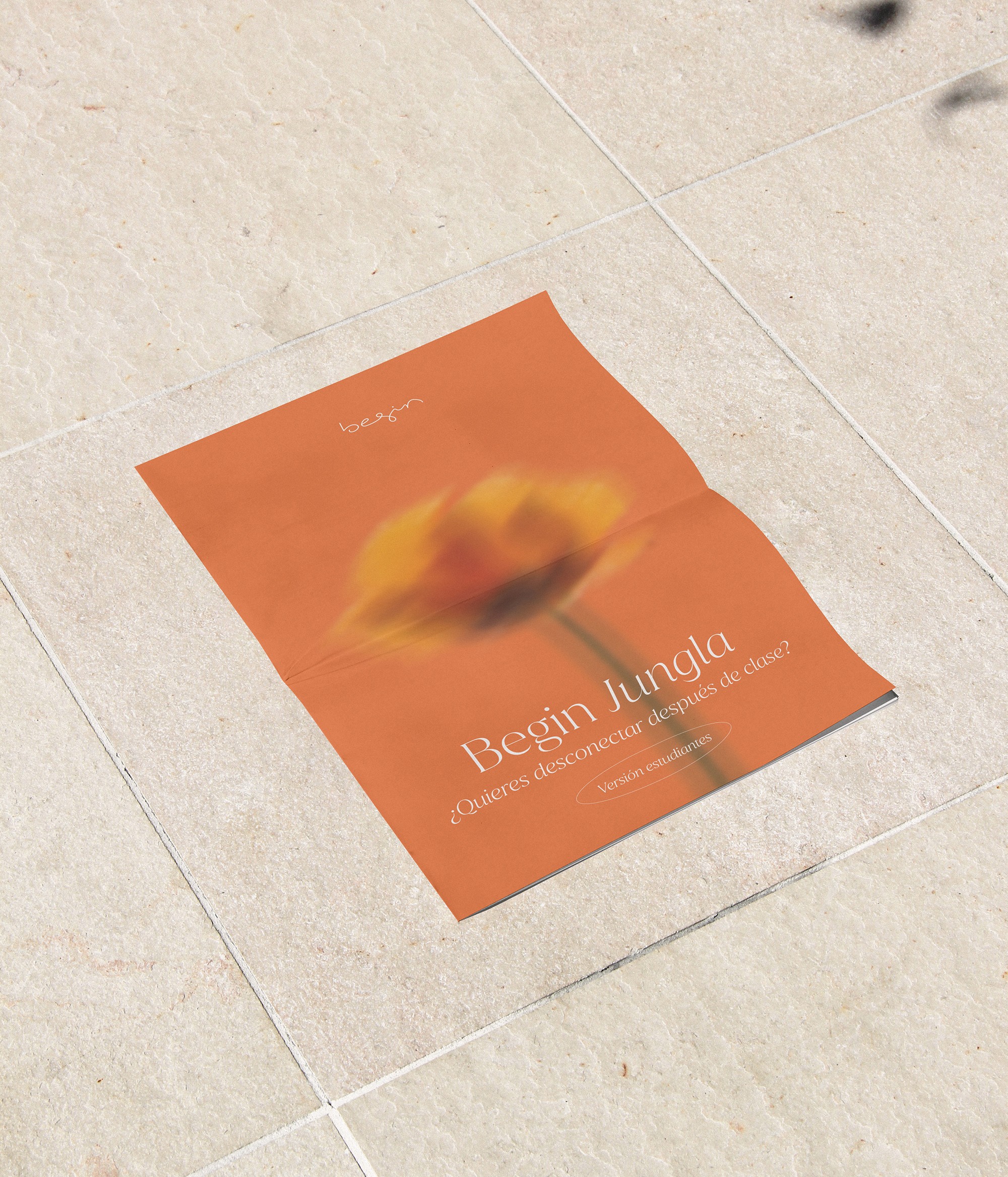
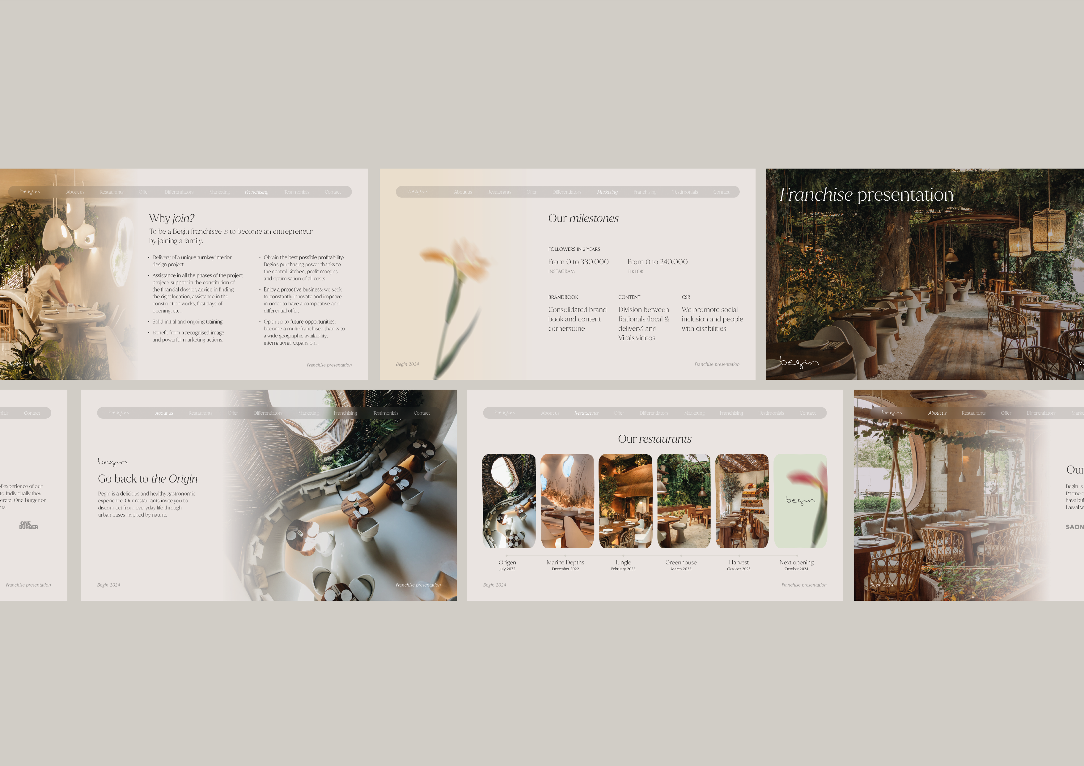
Working with a large-scale brand meant designing a system flexible enough to live across very different applications, yet unified by a coherent voice and a harmonious visual language.
Client: BEGIN RESTAURANTS
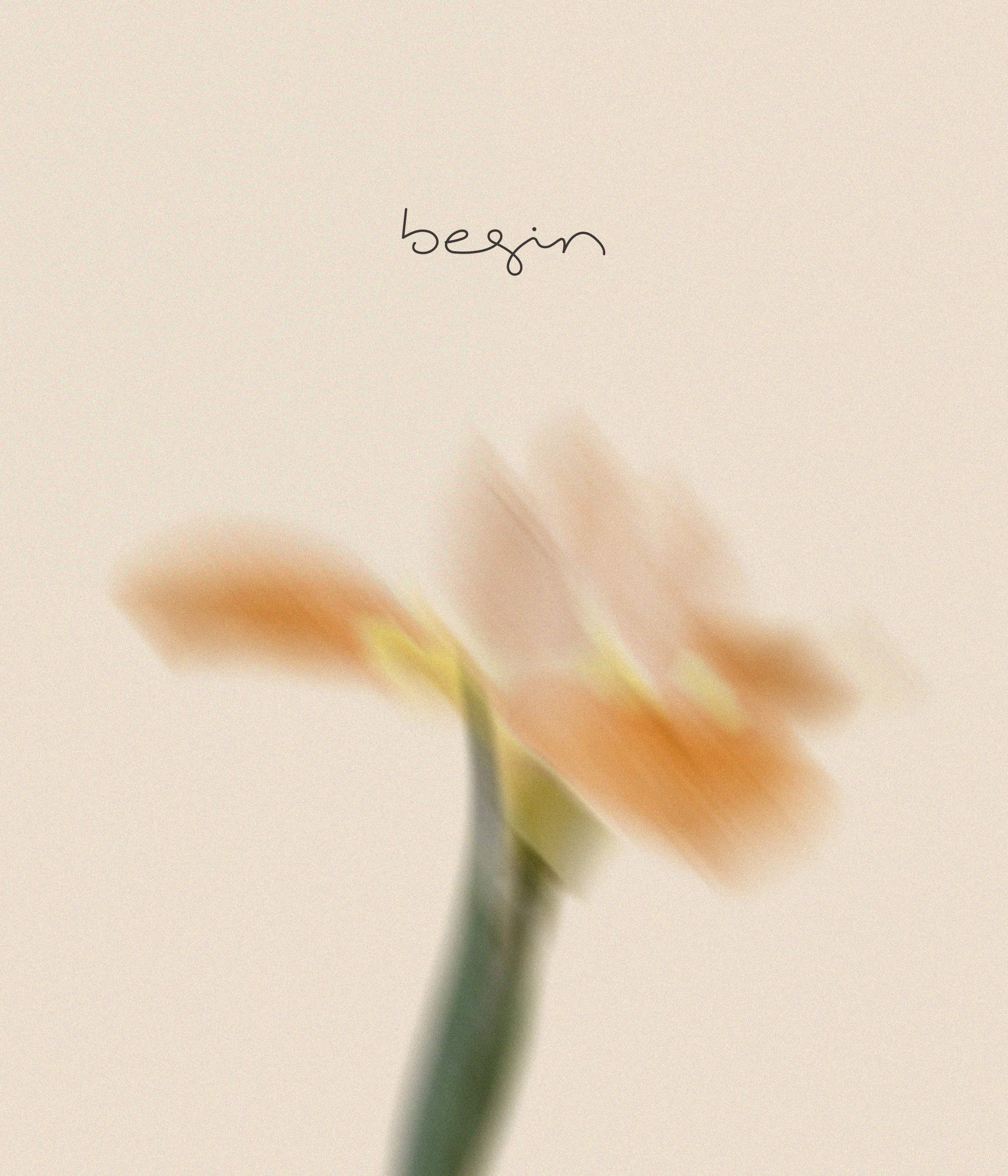
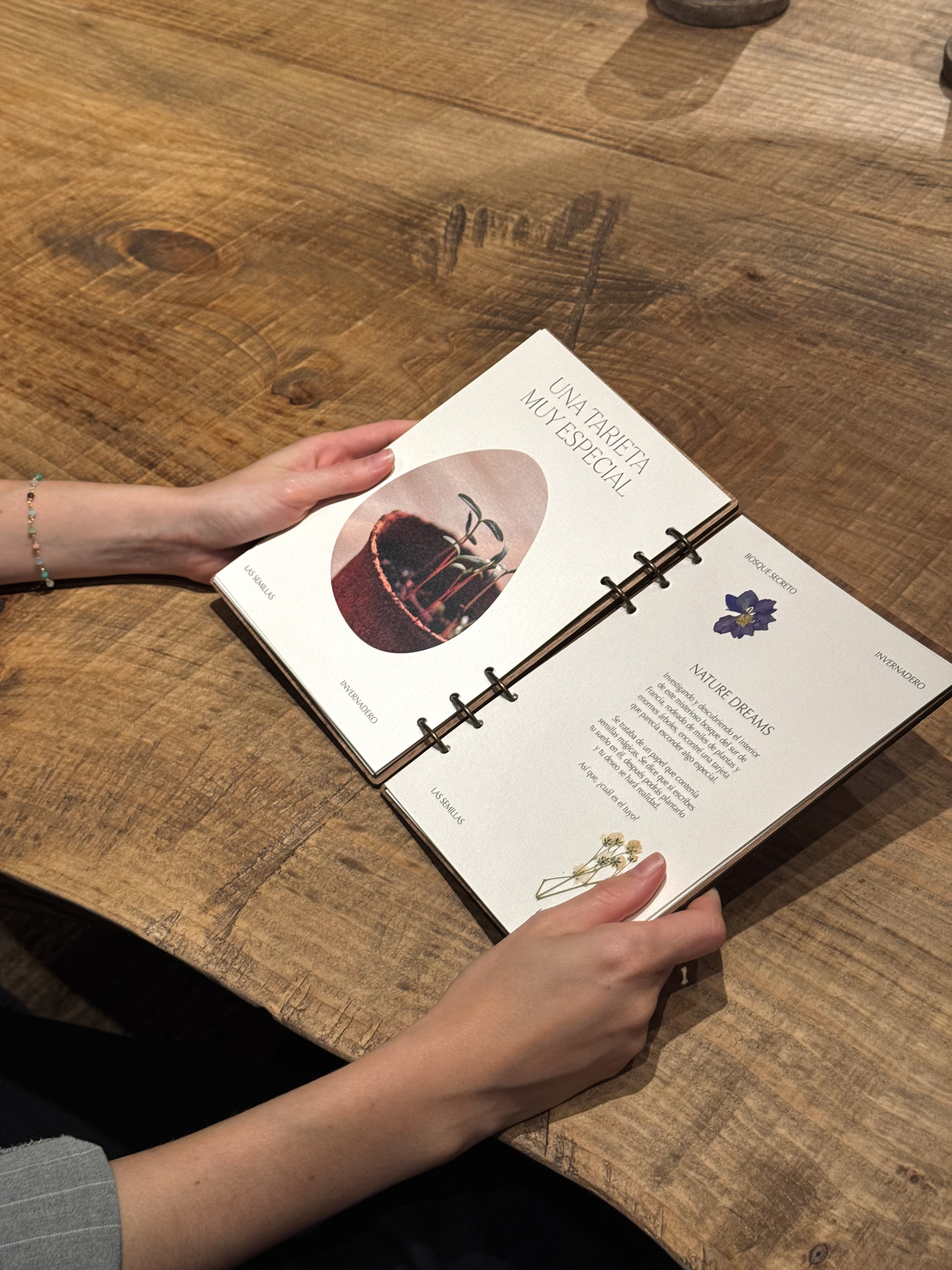

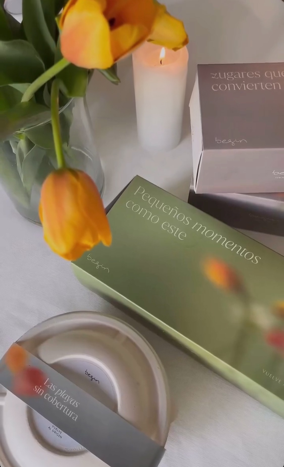
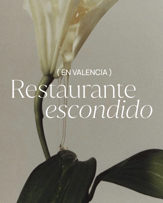
Through flowers, the brand finds its own visual language—unique, recognizable, and rooted in nature, reinforcing the connection with open-air spaces that flow through the group’s restaurants.

←
Previous project
next project
→